A Completely Refreshed Design for FanDraft
New features have been rolling out all year, but this one was overdue: a top-to-bottom redesign that makes FanDraft sleeker, more cohesive, and closer than ever to watching a real NFL draft.
If you’ve followed along this year, you know we’ve been busy. The End of Round Slide, faster league setup, hybrid draft support, position board displays — feature after feature has landed to make draft night bigger and better. But there was one project we knew was overdue, and today it’s here: a completely refreshed design for FanDraft.
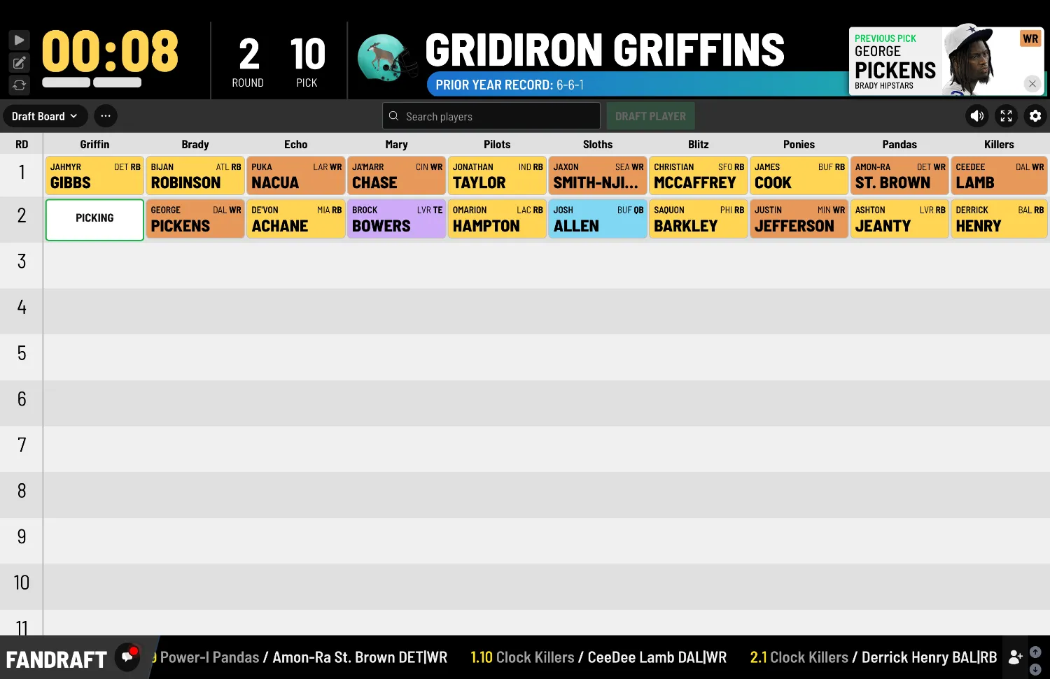
This isn’t a coat of paint. Every screen in the app — the draft board, the player board, pick announcements, auction views, setup flows — has been redesigned from the ground up to feel like one sleek, cohesive product.
Sleeker, more modern, more cohesive
The old FanDraft grew screen by screen over the years, and it showed. Different views had different personalities, and moving between them could feel like switching apps. The new design fixes that with a single, consistent visual language across the entire experience:
- A bold, broadcast-style header that keeps the pick clock, current round, and the team on the clock front and center — with the previous pick and who’s up next always in view.
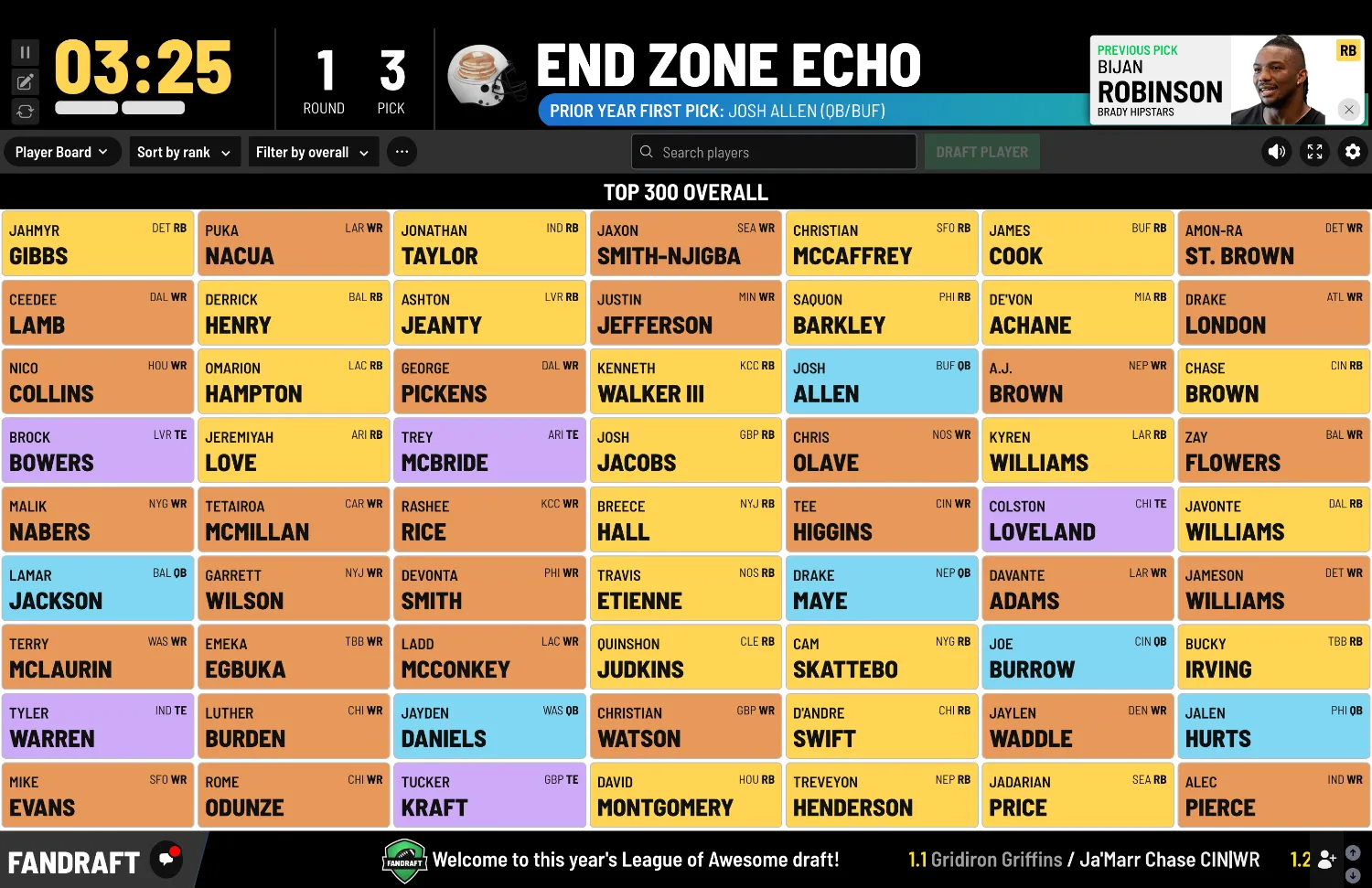
- Cleaner, higher-contrast player cards with the position color system you know, now sharper and easier to read from across the room.
- A modern dark chrome framing the board, so the picks themselves are always the star of the screen.
- Consistent controls everywhere — search, draft actions, and settings live in the same place on every view, so commissioners never have to hunt.
Graphics and animations that feel like game day
The whole reason FanDraft exists is to make your draft feel like a real NFL draft — and that feeling comes from the details. The refreshed design leans into it with better graphics and motion throughout:
- Picks slide onto the board with smooth, satisfying animations instead of just appearing.
- Pick announcements and the End of Round recap now look like true broadcast graphics packages, complete with player photos and team branding.
- The scrolling ticker along the bottom keeps recent picks flowing exactly like the chyron on draft night television.
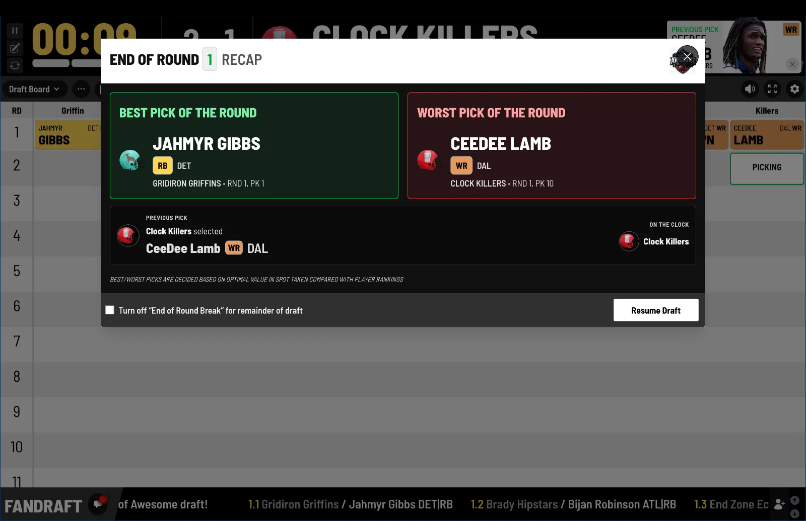
It all adds up to a draft room that doesn’t just track your picks — it puts on a show.
Built for the big screen (and every other screen)
The new design was built with the living-room TV in mind first, because that’s where draft night happens. Type is bigger and bolder, colors are tuned for projectors and 4K displays, and the layout makes every pick legible from the back of the room. And it scales down just as cleanly, so remote owners drafting from a laptop or tablet get the same polished experience.
See it for yourself
The refreshed design is live now for every league — no settings to flip, no upgrade required. Just open your draft and enjoy the new look.
Not running FanDraft yet? Create a free account and spin up a mock draft to see the new design in action, or browse the screenshots page for a full tour of the new look.
See it on your big screen
Create a free account and run a mock draft tonight.